Street-Art

Posts about “Street-Art” at the Teufelsberg Berlin.

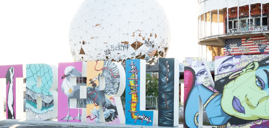
Land of Julia – A Brazilian Tribute at Teufelsberg

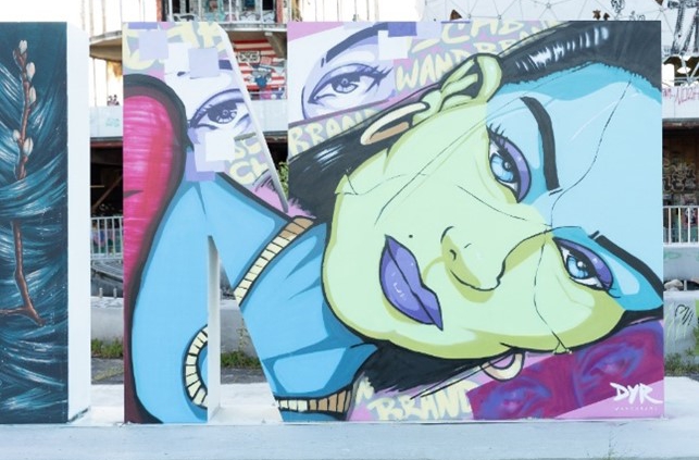
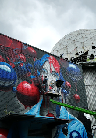
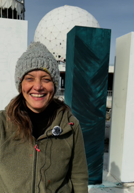
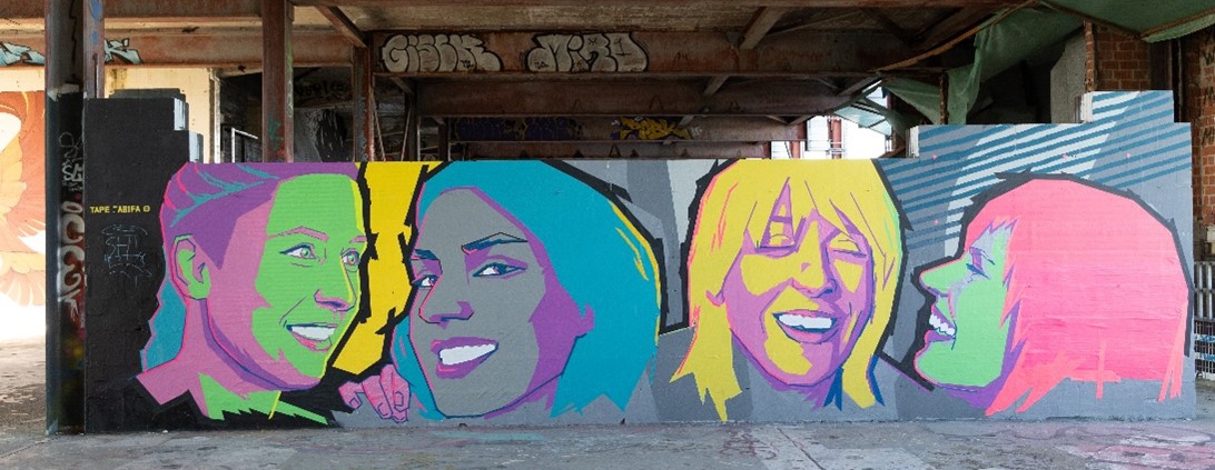
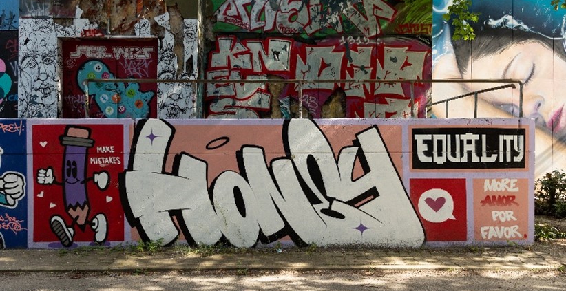
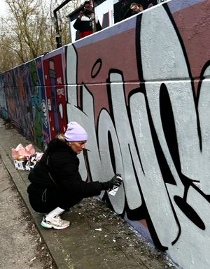
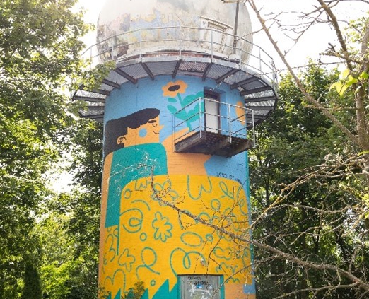
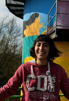
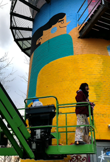
During the Power of Female Art festival in March 2024, the Jambalya Tower at Teufelsberg received a vibrant new look. Clearly visible from our bar, a colourful mural by Júlia Mota Albuquerque, better known as Land of Júlia, now adorns the striking structure. Her work merges Brazilian art history with her own illustrative style, creating a vivid statement of cultural diversity and female strength.

A Tribute to Tarsila do Amaral

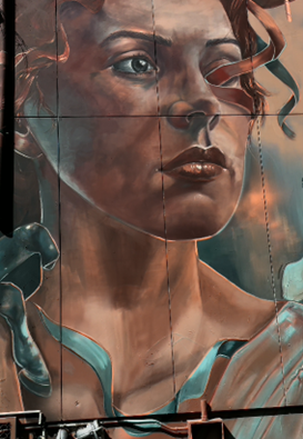
For her mural at Teufelsberg, Júlia drew inspiration from one of Brazil’s most renowned painters: Tarsila do Amaral. In particular, her iconic piece Abaporú—widely considered one of the most significant works of modern Brazilian art—served as a key reference. Abaporú features an oversized figure seated in a vast landscape, surrounded by a cactus under a radiant blue sky. The colour palette—blue, yellow, and green—mirrors the Brazilian flag.

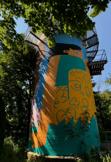
Júlia reinterpreted these elements in her own distinctive style. Her signature aesthetic, influenced by her background as an illustrator, is characterized by bold, flat shapes and a nearly cartoon-like appearance. The result is a contemporary take on Amaral’s work that not only pays tribute to Brazil’s artistic heritage but also establishes a visual connection between Berlin and Brazil.

The Power of Female Art festival celebrated women in art and made a powerful statement for greater visibility and equality in the art world. Júlia’s mural was a perfect example of the impact of female artistry—both as an inspiration and as an active contribution to the contemporary art scene. Her work at Teufelsberg is a striking testament to how female artists continue to shape history—both past and present.

Art Between Berlin and Brazil

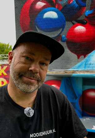
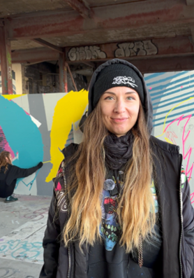
Júlia Mota Albuquerque hails from Minas Gerais, a large state in southeastern Brazil. Though she currently resides in Berlin, she frequently travels between the two countries, whether for artistic projects or simply due to her passion for discovering new places.

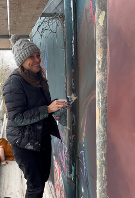
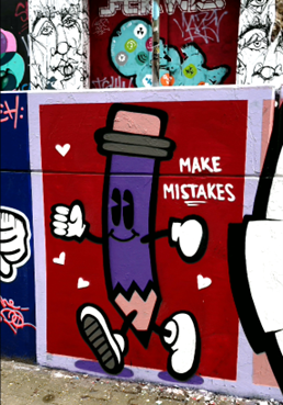
Her artistic range is broad: she works on digital illustrations for branding, advertising, and publications, as well as large-scale murals and installations. Making art accessible to everyone is especially important to her. That’s why she is drawn to urban spaces, where her murals not only enhance cityscapes but also engage local communities.

Diversity and Unity as Core Themes

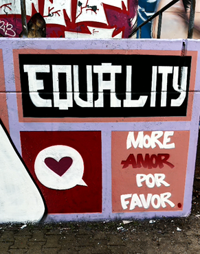
Júlia’s work revolves around themes of diversity, inclusion, and community. Her murals are not just visually striking—they carry a deeper message: they aim to bring people together and create a positive impact on the cities where they are displayed. This is why she is particularly drawn to bustling metropolises—she wants her art to be experienced, not just seen.

Beyond mural painting, she regularly experiments with new media. She illustrates, animates, paints objects, and explores textile techniques such as tufting. Her long-term goal is to create large-scale public installations—projects that go beyond art and foster interaction.

Júlia’s work can now be found in multiple countries. Her murals grace walls in France, Belgium, Germany, the Czech Republic, and Brazil. Her artistic signature is unmistakable: bold colors, clear shapes, and a playful yet profound visual language.

With her contribution to the Power of Female Art festival, Júlia Mota Albuquerque has not only added a new visual highlight to Teufelsberg but also brought a piece of Brazilian art history to Berlin. Her work honours the legendary Tarsila do Amaral while seamlessly fitting into Júlia’s own artistic vision: colourful, accessible, and carrying a powerful message.

Amanda Arrou-tea – The Power of Femininity in Colour and Water

Artist Amanda Arrou-tea, better known as Mandi Oh, was born in San Sebastián, in the Basque Country of Spain. Her art is deeply rooted in the connection between femininity, water, and the search for identity. Two of her stunning murals can be found at Teufelsberg in Berlin: Summer Solstice (2020) and Born Again (2024), the latter created as part of the Power of Female Art festival.

The Ocean as a Source of Inspiration

From an early age, Mandi Oh felt a strong connection to mermaids—not as mythical creatures, but as real, symbolic beings. This fascination followed her throughout her artistic journey. After completing her Fine Arts degree, she moved to Mexico, strategically settling near the cenotes—natural sinkholes filled with water—where she had once “discovered” her first mermaid.
Her travels eventually led her to Berlin, where she fully established herself as an artist. Her work reflects female empowerment and challenges the way the female body has been portrayed in a historically male-dominated art world.

Summer Solstice – A Monument to Freedom

The large-scale mural Summer Solstice spans nearly 120 square meters in the courtyard of Teufelsberg. It is part of her Mermaids series, which depicts women as confident, natural beings—free from societal expectations or sexualized depictions.

For Mandi Oh, water is the perfect medium to express this message. It symbolizes change, freedom, and the fusion of realism and abstraction. Her Mermaids represent women in their most authentic and powerful form, demanding to be seen and heard, rather than objectified. Summer Solstice captures the magic of a fleeting moment—an expression of vitality and independence.

Born Again – The Rebirth of a Woman

Four years later, in 2024, Mandi Oh created another mural at Teufelsberg during the Power of Female Art festival: Born Again. This piece is a tribute to women who undergo a profound transformation through motherhood.

The mural portrays Kristiana, a friend of the artist from Latvia, who had recently become a mother. With this work, Mandi Oh not only reflects on the physical process of giving life but also on the societal shift women experience after childbirth. Suddenly, they are seen primarily as “mothers,” while their previous identity fades into the background. Born Again celebrates this transformation and focuses on the woman as an individual—not just as a mother.

Feminism as a Guiding Theme

Feminist themes run through all of Mandi Oh’s works. She challenges the objectification of the female body and advocates for equality—removing the word “woman” from certain issues so they are recognized as universal concerns, not just “women’s problems.”
Her upcoming projects continue in this direction. She is currently collaborating with the EU and UNESCO on a new mural in Ustica, Sicily, highlighting climate change and the importance of marine conservation. In the future, she aims to evolve her style—moving away from hyperrealism toward a more fantastical and surreal artistic world.

A Lasting Impact

Mandi Oh’s murals at Teufelsberg are more than just impressive artworks; they carry a profound message. Her art subtly challenges perspectives, placing female experience, freedom, and self-determination at the centre. Through her Mermaids, the magic of water, and the strength of women, she leaves a meaningful mark on the Berlin art scene.

Letter N – DYR – Freedom and Pop Art in an Urban Context

Teufelsberg, a symbol of Berlin’s cultural diversity, serves as a unique canvas for artists to express their messages in remarkable ways. One such artist is Damian Yves Rohde, better known as DYR, whose contribution to the #FreiheitBerlin installation reflects his distinct style and creative vision.

“Glitch Bitch”: A Statement on Freedom and Diversity

The letter “N” in the #FreiheitBerlin installation, titled Glitch Bitch, embodies DYR’s interpretation of freedom. For him, freedom means the ability to “do and say what you want, as long as you don’t harm anyone. It’s a foundation, a basis where people don’t have to agree but can present their views and argue in a respectful way.” His work emphasizes respect for gender, religion, clothing, and lifestyle—independent of personal preferences.

The design of the “N” stands out with its vibrant colours, bold contrasts, and dynamic forms. The faces depicted, characteristic of DYR’s style, exude energy and emotion. The bright colour accents and glitch-inspired patterns in the background lend the piece a modern, digital aesthetic that is both playful and socially relevant. This fusion of pop art and social commentary makes Glitch Bitch a perfect representation of freedom within the Berlin context.

As DYR explains: “Berlin is a place where anyone can walk around as they please and say what they want, as long as they remain respectful.” This essence of tolerance and individuality shines through in his work.

From West Berlin to International Recognition

Born in 1985 in West Berlin, Damian Yves Rohde grew up in a multicultural environment that deeply influenced his artistic journey. Raised in the vibrant Kreuzberg and Schöneberg art scenes, he was surrounded by budding and established artists, which fostered his early passion for art. The graffiti culture on the Berlin Wall and exhibitions he attended further shaped his creative development.

Since 2020, DYR has leaned further into pop art, developing a unique style. He abstracts faces from his close circle, reducing them to essential features while maintaining their recognizability. His work is both deeply personal and universally relatable, earning him recognition not just in Berlin but also internationally, with exhibitions in Paris, London, and other cities.

Between Wildness and Individuality

In addition to his contribution to the #FreiheitBerlin installation, DYR created another remarkable piece in the Gallery Tower at Teufelsberg. This mural combines human and animal elements in a dynamic display of his pop art aesthetic.

At the centre of the mural is a stylized bear’s head, complete with bright orange sunglasses and a wide-open mouth showcasing sharp teeth. The bear is simultaneously aggressive and playful, symbolizing Berlin’s untamed energy, wrapped in a modern cultural vibe.

Flanking the bear are two abstracted human figures, crafted in the same distinctive style as the faces on the letter “N.” Their vibrant colours, striking facial features, and playful accessories demonstrate DYR’s unique interpretation of individuality and diversity. The connection between the mural and the “N” underscores DYR’s consistent artistic identity, weaving a recognizable thread through his works.

The mural’s background features deep, rich tones that enhance the boldness of the figures and the bear, creating a striking visual impact. This stylistic continuity between the letter and the mural showcases how DYR translates his signature approach across different formats, while still telling new stories.

Karskione – When Art, History, and Music Unite

At Teufelsberg in Berlin, art and history blend seamlessly to create a one-of-a-kind space where creativity knows no bounds. In May 2024, during the Live Street Art Week, Dutch artist Karski Roy Valk, known as Karskione, created a stunning mural that connects history, music, and art in a deeply impactful way.

A Tribute to History and Symbolism

Karskione’s mural immediately draws attention: a woman with a pensive, melancholic expression surrounded by floating red and blue balloons. On closer inspection, you can count exactly 99 balloons—a direct nod to Nena’s iconic song “99 Luftballons.” The song, which addresses surveillance and tensions during the Cold War, resonates deeply with the history of Teufelsberg, once a radar station used to monitor Soviet activity.

Karski explains his inspiration: “This place was used in the past to monitor the Russians. Whenever I’m in Germany, I always think of this song. It was the perfect location to bring this idea to life, especially with the large white balloons that were once part of the radar systems.

The mural showcases Karskione’s signature style: a harmonious balance of abstract elements and realistic depiction. The floating balloons evoke a sense of lightness, while paint drips and intricate details give the mural vibrancy and motion. The palette of blues and reds enhances the nostalgic yet timeless feel of the artwork.

However, this mural is more than just a visually striking piece. It is a reflection on the history of Teufelsberg and the themes of freedom and surveillance. Through this work, Karskione encourages viewers to contemplate the past while connecting it to a universal message of liberty and peace.

A Life Dedicated to Art

Born in the Netherlands, Karskione is a prominent figure in the international graffiti and street art scene. His artistic journey began at the age of 10, sneaking out at night to spray-paint his first creations. This early passion never waned and has since propelled him to global recognition as an artist.

His distinctive style combines photography and graffiti, creating works that are both deep and visually striking. Known for vibrant colors, dynamic details, and boundless creativity, Karskione’s pieces bridge the abstract and the realistic in unique ways.

Yet, his art goes beyond aesthetics. Karskione is actively involved in charitable projects, working with orphaned children and creating murals in countries like Zimbabwe to convey social messages and empower communities. Each of his works tells a story—of the past, the present, and the hope for a better future.

Letter I – Caro Pepe – Creativity that Moves and Inspires

At Teufelsberg, history meets contemporary art—a place where creative visions come to life and visitors leave inspired. One artist who has left a lasting impression here is Caro Pepe. Originally from Argentina and living in Berlin since 2012, Caro Pepe has created two remarkable works: the letter “I” for the #FreiheitBerlin installation and the mural “Rebellion in the Carousel” as part of the 2024 Power of Female Art Festival.

A Visual Meditation

Caro Pepe’s contribution to the #FreiheitBerlin installation explores the concept of freedom in its most profound and emotional sense. Her letter “I” is not just a visual piece—it is a philosophical one. For Caro, art is freedom: the freedom to express emotions, organize thoughts, and let go of burdensome ideas. She describes her creative process as a meditative act: “Art makes me feel lighter, it fulfills me, and it frees me from unwanted things.”

The background of her work features fluid, vibrant brushstrokes in varying shades of blue, creating a sense of powerful motion—almost as if an invisible wind sweeps through the piece. This dynamic structure gives the letter an energy that symbolizes freedom as movement and transformation.

At the center of the letter, a branch with budding leaves emerges, representing growth, renewal, and breaking free from rigid structures. These buds seem to grow directly out of the swirling background, suggesting an organic emancipation driven by inner forces. This interplay between the dynamic backdrop and the organic center showcases Caro Pepe’s skill in weaving visual and emotional layers. For her, this piece is a reflection on freedom as an internal journey: “Freedom that releases us from heavy thoughts and freedom that allows us to grow.”

Introspective Art

Caro Pepe’s artistic journey began in advertising, where she worked as an art director in Buenos Aires and Madrid before committing fully to her passion for art. After moving to Berlin in 2012, she launched her career as a freelance artist and muralist, painting and exhibiting her work worldwide—from Europe and South America to Asia.

Her art is characterized by an intimate engagement with emotions, with her iconic “One-Eyed” women being a recurring motif. These figures represent subjectivity and personal perception of reality. “We all see only a part of the truth and define our world based on that,” she explains. This introspective perspective runs through her entire body of work, making it both deeply personal and universally resonant.

Strength and Transformation

In addition to the letter “I,” Caro Pepe created the striking mural “Rebellion in the Carousel” during the 2024 Power of Female Art Festival. Painted on the wall of the former canteen, this piece tells a story of resilience and breaking free from old patterns.

At the center of “Rebellion in the Carousel” stands the one-eyed woman, surrounded by a crumbling carousel—a metaphor for endless cycles and repetitive routines. She actively dismantles the carousel, and its fragments and loose ribbons visually capture the moment of liberation. The woman exudes determination and strength; her upright posture and intense gaze, even with only one visible eye, convey both depth and resolve.

Caro Pepe’s technical approach enhances the drama and symbolism of the piece. Using spray paint, acrylics, and wall emulsion, she brings movement and vitality to the scene. The warm copper tones combined with cool blues create a compelling contrast between the stability of the central figure and the chaos of the collapsing carousel. Up close, intricate details like the ornate manes of the carousel horses become visible, while from a distance, the mural reveals its full, commanding presence.

This mural is not just a visual masterpiece but also a profound symbol of courage—the courage to break free from entrenched patterns. It invites viewers to reflect on their own cycles and inspires them to take the leap toward transformation.

The Letter L – RON MILLER – The Visionaries Behind the Geisha

At Teufelsberg, artists from around the world bring history and art to life through their works. One standout piece is the letter “L” from the #FreiheitBerlin installation, created by the Berlin-based artist duo RON MILLER. With their unique blend of urban style, conceptual art, and symbolism, they tell stories of freedom, identity, and inner strength.

Captured Yet Free

The letter “L” immediately catches the eye with its vibrant colours and powerful symbolism. At its centre stands a yellow figure, bound by pink ropes – a clear metaphor for restriction. Yet, the deeper meaning lies in the details: the figure, whose stylized form evokes RON MILLER’s iconic Geisha, conveys a sense of boundless inner freedom. Despite external constraints, her spirit remains unbroken and free.

The duo describes their vision as follows: “Freedom means having the ability to think, act, and decide without pressure or limitations. Our protagonist is figuratively tacked onto the letters. Her body may be trapped, but her thoughts wander into boundless realms. In her mind, freedom blooms – unbound and infinite – while her body remains held in place. Her soul dances in the light of endless possibilities, free as the wind.”

The Geisha, a central motif in RON MILLER’s work, perfectly encapsulates this message. Inspired by a past love and a deep appreciation for Asian culture, the motif has evolved over the years. Today, the Geisha represents a dynamic, urban identity that adapts to different contexts. Her face, often left as a blank white space, invites viewers to project their own interpretations and experiences onto the figure.

Two Friends, One Vision

Behind RON MILLER are best friends Ronny Kindt and Marcus Klüh, whose longstanding friendship forms the foundation of their creative vision. Since 2016, they have combined their individual strengths to create a unique artistic style. Marcus Klüh grew up as a creative child who loved to build things with his hands. This craftsmanship is evident in many of their works. Ronny Kindt, with a background in graphic and interior design, has worked as a creative director for over a decade. His passion for design and Asian culture plays a significant role in their art.

Their work combines urban aesthetics, pop art, and conceptual depth. The recurring motif of the Geisha and their ability to address societal themes like commercialization, identity, and freedom make their art both striking and thought-provoking.

Bold, Yellow, and Critical: Artwork at the Tower

Another notable work by RON MILLER once adorned the entrance of the tower at Teufelsberg, though it no longer exists. Painted in vivid yellow, the piece prominently featured their provocative motto “FUCK FAME”, which stretched across the wall as a graphic element. Through this slogan, RON MILLER criticizes the superficial glorification of fame and popularity in a world where art and culture are increasingly commodified and digitalized. At the same time, the motto is ironic – a call to focus on authenticity and creative freedom.

At the centre of the work was a large Geisha with a red rectangle covering her eyes and wearing a mask reminiscent of a protective face covering. This detail subtly connected the artwork to contemporary societal themes. The scene was completed by numerous smaller Geishas dressed as Superman or, more fittingly, Superwoman, breathing life into the wall and reflecting the complexity of modern identity.

RON MILLER’s contribution to the #FreiheitBerlin installation, along with their other works, demonstrates how art can reflect and interpret societal themes. Their use of the Geisha as a central motif represents the fluid and ever-changing nature of urban identity. At the same time, their works are deeply ironic, layered, and provocative, encouraging viewers to engage with the questions and challenges of our time.

Letter R – KOTTITAUBE – Pigeons as a Statement

When you look at the #FreiheitBerlin artwork at Teufelsberg, the powerful ‘R’ immediately draws you in. This creation is the work of Till Jürgens, better known as KOTTITAUBE, a Berlin-based graffiti artist and communication designer. His name reflects his roots in Kottbusser Tor, Kreuzberg, where he grew up in the 1980s, deeply influenced by Berlin’s vibrant lifestyle and rebellious graffiti culture.

The Language of Pigeons

KOTTITAUBE uses the ‘R’ to tell a powerful and layered story. On one side, a pigeon is bound with red barbed wire—an evocative symbol of restriction and oppression. On the other, the barbed wire unravels, and the pigeon takes flight into freedom. This stark contrast captures the tension between control and liberation, a universal theme relevant in many global contexts.

The pigeon depicted is not the traditional white dove of peace but a gray urban pigeon—a deliberate symbol of city life. It represents adaptability and resilience, shaped by the harsh realities of urban environments like Berlin, where KOTTITAUBE himself grew up.

The ‘R’ features phrases such as “R as in fRRee Palestine! R as in Rafah! Don’t let them silence your beak!” These words highlight the Israeli-Palestinian conflict and the city of Rafah in the Gaza Strip, symbolizing blockades and military tensions. The red barbed wire reinforces these themes, representing both restrictions and the persistent yearning for freedom.

Another striking detail is the red figure riding the pigeon, carrying a white flag with a watermelon. The watermelon, with its colors—red, green, white, and black—mirroring the Palestinian flag, has become a symbol of resistance. It is often used as a subtle expression of cultural identity and solidarity in the face of restrictions.

The repeated emphasis on the letter ‘R’ is multi-faceted: “R as in fRRee Palestine!” and “R as in Rafah!” not only refer to the letter itself but also evoke the cooing of a pigeon—a rough “Grrr” that symbolizes persistence and resilience.

The artwork’s details are captivating: the pigeon’s determined gaze, the red barbed wire winding through the scene like a silent reminder, and the surreal crystalline forms at the bottom of the letter. Each element highlights the obstacles that must be overcome to achieve freedom and peace.

KOTTITAUBE’s Roots

KOTTITAUBE describes himself as an artist whose life has been shaped by letters. His love for typography began in his youth when he gained international recognition alongside other graffiti artists. He later deepened this passion through studies in communication design, exploring new media such as 3D modeling, video animation, and virtual reality.

His artistic versatility is the result of a decades-long dedication to letters, colors, and design. From the graffiti of Kreuzberg’s streets to cutting-edge digital projects, KOTTITAUBE has seamlessly blended tradition and innovation in his work.

A Faceless Pigeon

On the second floor of the Teufelsberg tower, KOTTITAUBE has created another remarkable piece: a monumental urban pigeon with an expansive wingspan. Notably, the pigeon’s face is hidden—obscured by a red line that acts like a barrier or dividing mark. This detail invites interpretation: it could symbolize the invisibility and silence faced by urban pigeons and people alike, particularly those in marginalized or conflict-laden environments. It serves as a reminder of how easily individuals can be overlooked or pushed to the fringes.

The crystalline structures surrounding the pigeon, reminiscent of shattered glass or ice, enhance the contrast between strength and fragility. They seem to represent both obstacles and the beauty that can emerge amidst danger. This dynamic tension makes the artwork a visual metaphor for the challenges of urban life or conflict-ridden contexts.

This mural reflects KOTTITAUBE’s signature style: an exploration of contrasts such as strength and fragility, visibility and invisibility. The pigeon, a symbol of adaptability and resilience, remains an enigma, challenging viewers to look deeper and derive their own interpretation of the intricate message.

Through his works at Teufelsberg, KOTTITAUBE demonstrates not only his artistic skill but also his ability to convey complex ideas through subtle symbols and powerful imagery. His pigeons stand for resistance, adaptation, and the relentless pursuit of freedom—both in Berlin and around the world.

Fabifa – Redefining Tape Art

When you think of street art, tape might not be the first medium that comes to mind—but for Fabifa, it is the perfect tool. She proved this at Teufelsberg, where her extraordinary tape art brought an impressive vision to life. Her works combine clean lines, vibrant colours, and profound messages, transforming tape into a surprisingly powerful form of artistic expression.

Friendship in Focus

At the Power of Female Art Festival in March 2024, celebrating International Women’s Day, Fabifa created a piece titled “Female Friendship.” This artwork is a deeply personal statement, featuring Fabifa herself (on the left) alongside her three closest friends, who have been a part of her life for years. “We have been best friends for years, and I thought today was the perfect opportunity to depict and celebrate female friendship,” she explains.

Using her signature medium—tape—Fabifa crafted figures that radiate dynamism and joy through vibrant colours and precise lines. Bold shades of pink, yellow, and turquoise capture the energy and strength of female relationships. The figures’ smiles convey a sense of intimacy and shared happiness. What’s particularly remarkable is how Fabifa uses the interplay of geometry and colour to imbue each figure with emotion and personality.

The piece invites viewers to reflect on the power of friendship—the people who support and inspire us. It is not just an artistic homage but an emotional celebration of the connections that enrich our lives.

Fabifa’s Journey to Artistic Fulfillment

Behind the name Fabifa is Valeryia Losikava, born in 1987 in Minsk, Belarus. In 2015, she moved to Berlin—a city that offered her freedoms she had never known before. “Freedoms of self-expression, self-realization, sexuality, and politics,” she describes, highlighting the transformative impact of her new home.

Fabifa’s art is defined by precision, emotion, and a unique sense of colour and form. She draws inspiration from Berlin’s club culture, Soviet poster art, Japanese woodcuts, and her own personal history. This fusion of traditional influences and modern perspectives results in a style that’s entirely her own.

For Fabifa, art is much more than a form of expression—it is a message. “My work tells stories of freedom and transformation. It is my way of making emotions and personal experiences visible,” she explains.

Breaking Chains

In 2019, Fabifa created a monumental wall piece at Teufelsberg, tackling the theme of breaking free from gender stereotypes. The 20-meter-tall artwork featured a figure symbolically breaking chains—a powerful image of overcoming societal constraints.

Her use of bold colours—pink, blue, and grey—challenged traditional gender associations and deliberately questioned them. The provocative text, “Eat Your Fetters,” encouraged viewers to liberate themselves from limitations and embrace individuality.

Although this piece no longer exists and cannot be seen on-site, it remains a significant milestone in Fabifa’s artistic journey. Its message continues to resonate as part of Teufelsberg’s history and as a symbol of courage in questioning societal norms.

Fabifa Inspires Berlin

Fabifa’s innovative tape art has left a significant mark on Berlin. In 2023, she designed the facade of the Illuseum Berlin, incorporating interactive elements like hands, negative spaces, and a red heartbeat line, perfectly blending illusion and emotion.

In 2021, during the global lockdown, she created a powerful political work for the Hebbel am Ufer Theater, addressing the pro-democracy protests in Belarus. Her facade became a striking symbol of social change and political resistance.

Another standout project was her futuristic installation, “Project Cyberbase,” at the Game Over Exhibition in Luce Studio. This piece combined tape art with music, projections, and interactive elements, creating a unique, multisensory experience.

Through these projects, Fabifa has shown that tape art is far more than a visual medium. She has transformed it into a platform that unites emotions, social issues, and creative visions in a way that’s truly groundbreaking. However, for Fabifa, these accomplishments are just the beginning. She plans to push her artistic boundaries even further, explore new materials, and share her messages with audiences around the world. Her art remains a testament to the power of creativity and its ability to inspire change and connection on a global scale.

Letter E – CAZ.L – Art That Connects and Inspires

CAZ.L is one of the most exciting names in the international street art scene. Through her powerful stencil and mural art, she brings walls to life, blending urban energy with profound messages. At Teufelsberg, she has left her mark with two impressive works: the striking “E” from the #FreiheitBerlin installation and the captivating “Medusa” mural, created during the Power of Female Art Festival in 2024. Both pieces tell stories of freedom, resistance, and the vibrant energy of city life.

The Thieves of the City

Standing before the “E” of the #FreiheitBerlin installation, you’ll encounter two iconic urban dwellers: a seagull and a crow. With these clever birds, CAZ.L captures the essence of city life. Seagulls and crows are masters of adaptation—free and independent, navigating urban landscapes, taking what they need, and overcoming barriers with ease.

The bold magenta background makes the birds stand out vividly. Around their necks hang peace pendants, a deliberate symbol that ties the message of freedom to a call for peace. CAZ.L describes her work as follows: “The crow and the seagull, the thieves of the city. Clever and skilled, they take their freedom.”

Through this piece, CAZ.L shows that freedom is never a given—it requires responsibility, creativity, and courage. The birds represent an unyielding desire for independence but also reflect the challenges that come with such freedom. This “E” is more than just a letter—it’s a powerful statement about urban life: raw, free, and full of possibilities.

CAZ.L and Her Vision

Behind the name CAZ.L is Ann, a Berlin-born artist who has gained worldwide recognition for her extraordinary stencil and mural art. Her artistic journey began on the streets of Berlin, where she transformed the city’s facades into stunning canvases. To reach the tallest walls and enjoy the breathtaking views over the city’s rooftops, she even went so far as to earn a crane operator’s license.

Her works are characterized by a harmonious interplay of color, light, and shadow, bringing both small-scale and large-scale pieces to life. She says of her mission: “My art is meant to spark unexpected smiles and bring a sense of community to neighborhoods.

As a three-time finalist of the World Stencil Art Prize, CAZ.L has firmly established herself in the international street art scene. Her art can be found on the streets of cities across Europe and the USA, as well as in renowned galleries. Through her work, she combines creativity, a social message, and a desire to connect people.

Medusa: Between Myth and Reality

One of CAZ.L’s most striking murals was created as part of the Power of Female Art Festival on International Women’s Day in March 2024. Located in the Kantine at Teufelsberg, the mural “Medusa” explores a different kind of freedom—one of self-determination and resistance against injustice.

In this piece, the mythological figure Medusa is reimagined in a powerful and evocative way. Once a priestess of the goddess Athena, Medusa was renowned for her extraordinary beauty—a gift that became her curse. She was assaulted by the sea god Poseidon in Athena’s temple, and Athena, perceiving the act as a violation of her sacred space, transformed Medusa into a monster. From that moment, any man who looked upon her would turn to stone.

Using vivid colors, intertwined serpents as hair to emphasize her dual nature, and a piercing gaze, CAZ.L portrays Medusa in all her complexity. She is both victim and warrior—a symbol of pain, strength, and transformation. The mural seamlessly merges mythology with a modern feminist perspective, highlighting how women are often forced by external violence to discover their inner power. This message resonated strongly within the context of the Power of Female Art Festival.

Whether you’re marveling at the clever birds in the “E” or standing before “Medusa’s” penetrating gaze, CAZ.L’s art is sure to captivate and move you. Both works invite reflection and leave a lasting impression.

Honey Beebs – Graffiti with Heart and Soul

If you are heading to the basketball court, you will pass by a remarkable piece of art: a mural by Berlin-based graffiti artist Honey Beebs, one of the most prominent female voices in Berlin’s graffiti scene. As part of the Power of Female Art Festival in March 2024, she created an impressive mural on Teufelsberg, blending her signature style with a powerful message that’s as visually captivating as it is meaningful.

Honey Beebs has been active in the graffiti world since 2018, known for her distinctive style writing that focuses on classic letterforms. Inspired by hip-hop culture, her work stands out for its vibrant color schemes and strong concepts. She masterfully combines direct messages with a playful approach, making her art accessible yet impactful.

For this festival, Honey Beebs chose a deliberately minimalist yet striking approach. Her bold “Honey” lettering takes center stage, accompanied by a charming cartoon character: a smiling, walking pen with the message “Make Mistakes.” This whimsical companion reminds us that mistakes are a natural and essential part of the creative process.

The mural also features the powerful words “Equality” and “More Amor Por Favor,” which she incorporated in honor of International Women’s Day. With these phrases, Honey Beebs advocates for equality and calls for more kindness and love in everyday life. “I wish we could all just be kinder to each other,” she explains. These sentiments perfectly reflect the essence of her art—an appeal for humanity, respect, and solidarity.

The color palette of the piece is clean and harmonious. Soft pastels, contrasted with bold black and red accents, create an inviting atmosphere. From afar, the design draws attention, while up close, the details invite viewers to explore further.

You may have already come across Honey Beebs’ work in other locations. She created a mural at Freiland Potsdam, showcasing her distinctive artistic voice, and participated in an exciting project by Turbulence TXL, which is transforming the freight canteen at the former Tegel Airport into an open-air venue. These projects highlight the versatility and presence of her work in the street art scene.

Honey Beebs has become a key figure in Berlin’s graffiti community and has also earned international recognition for her art. Her work represents creativity, diversity, and the power of graffiti to convey meaningful messages. This mural on Teufelsberg is a perfect example of her style: a fusion of sharp aesthetics, playful elements, and profound messages.

Take a moment to explore the details of this piece. Notice the lines, the colors, and the placement of the messages. Perhaps the words “Make Mistakes” or “More Amor Por Favor” will inspire you to bring more of that spirit into your own life. Because ultimately, that’s what this artwork seeks to achieve: a little more joy, humanity, and openness in the world.